Saddle Pass
Booking a farrier, a trail ride, or a stall still happens over text message and Facebook groups. Saddle Pass is the attempt to give that market a real product — and I owned the experience from field research through engineering handoff.
The problem
The equine services market runs on group texts, Facebook groups, and word of mouth. If you want a trail ride in an unfamiliar area, a farrier on short notice, or a stall for a night while hauling, you ask around. There is no discovery layer, no way to check that the person showing up is who they claim to be, and no payment rail — money moves by Venmo and handshake.
That creates two problems that a marketplace has to solve at the same time. Riders cannot find providers. Providers cannot prove they are credible to someone who has never met them. Solve only the first and you have a directory nobody trusts; solve only the second and you have a verification service with no demand attached.
I spent the first weeks in field research with barns, trainers, and riders before drawing anything. The single most useful finding was not about features.
Three user types, not two
Marketplace design usually assumes two sides: supply and demand. Saddle Pass has three — riders, horse owners, and service providers — and in the real world those identities overlap constantly. A horse owner who leases out trail horses is also frequently a service provider offering lessons. A rider who boards her own horse is also an owner.
The obvious move is to make people pick one and let them add roles later. In testing, that produced visible hesitation: people stalled on the choice because picking wrong felt consequential, and they had no way to know what picking wrong would cost them.
The fix was not a new flow. It was removing the stakes from the decision.
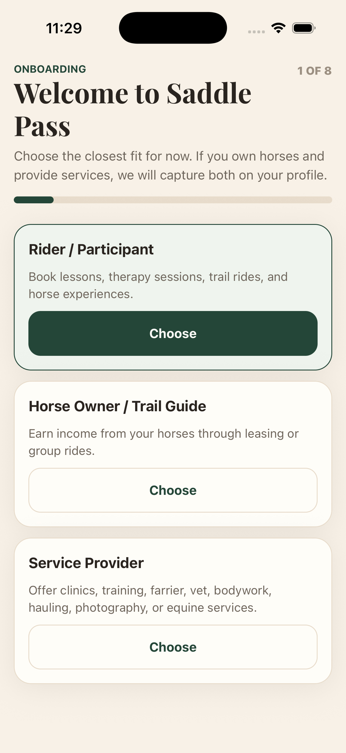
The roles also had to stay legible to the other side of the marketplace. A rider booking a service needs to know what kind of person they are looking at, so the role labels are written as plain descriptions of what someone does — “Offer clinics, training, farrier, vet, bodywork, hauling, photography, or equine services” — rather than internal category names.
Onboarding is the trust layer
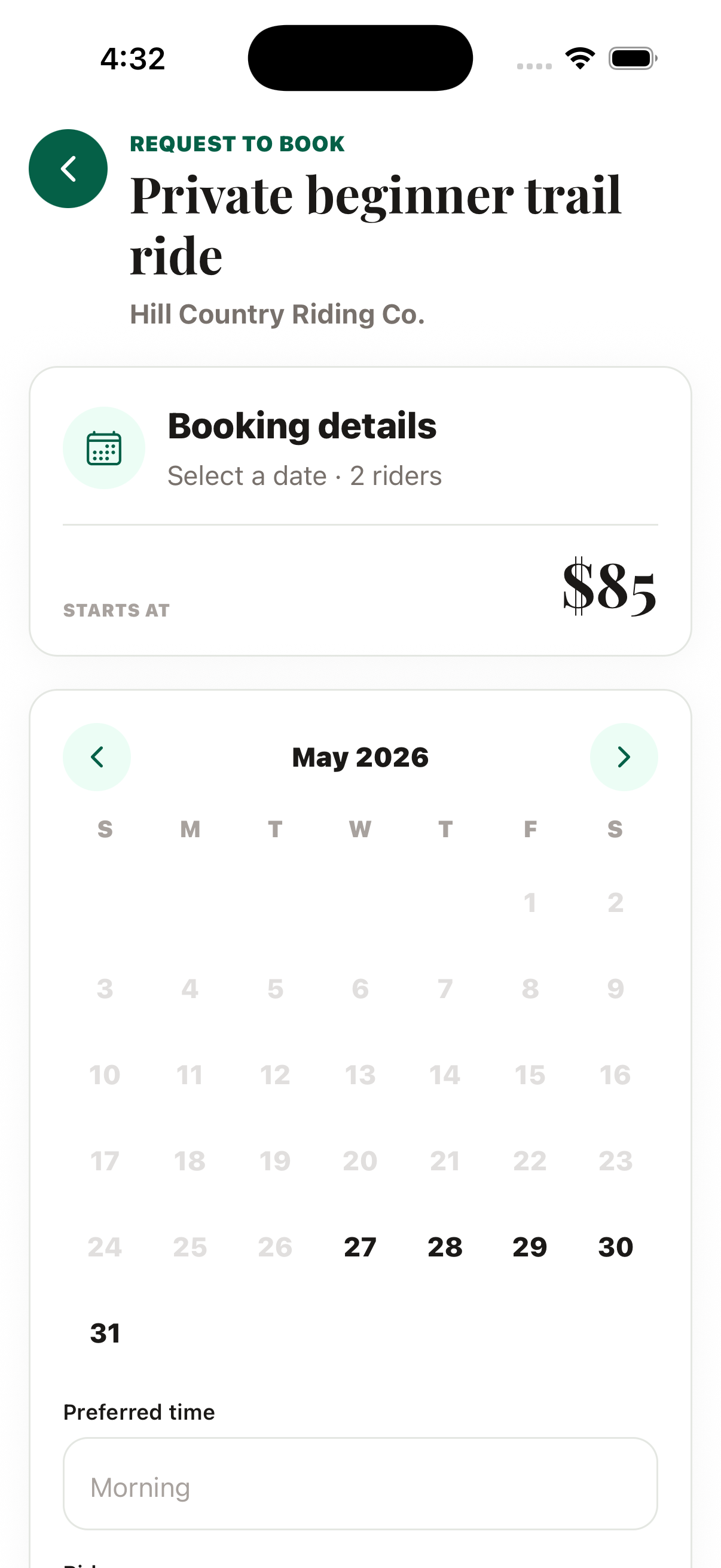
The eight-step onboarding is the longest flow in the product, and that is deliberate. It is where the marketplace’s trust problem actually gets solved. Depending on role, it collects credential verification, a liability waiver, ID upload, service rates, horse records, and Stripe Connect payout details.
Long onboarding is normally a conversion problem. Here the constraint ran the other way: a provider who has not been verified cannot be shown to riders at all, so an abandoned onboarding produces a user who can never transact. The design question was not “how do we make this shorter” but “how do we make each step feel like it is buying the user something.”
Each step states what it unlocks rather than what it requires. Verification is framed as what makes you bookable, not as a hurdle. Where a step is genuinely optional it is marked optional, and the flow persists so a user can leave and return without losing work.
The design system, and why it had tests
The product ships to three codebases — a React web app, a React Native app, and a Flutter app. A design system that exists only in Figma does not survive that. It drifts within a sprint, and the drift shows up as three slightly different greens and four button heights.
So the system’s source of truth is a token file in the repository, with a sync script and tests that fail the build when a codebase’s palette diverges from it. Colour, type, spacing, and the icon manifest all normalise through it.
This is the part of the project I would point a design systems team at. Not the component inventory — most designers can produce one — but the fact that the system has an enforcement mechanism. Design decisions that cannot be enforced are suggestions.
A redesign review, and what it changed
In late May I ran a full screen-by-screen review of the app against the design system and redid the set. The most instructive change was the smallest one.
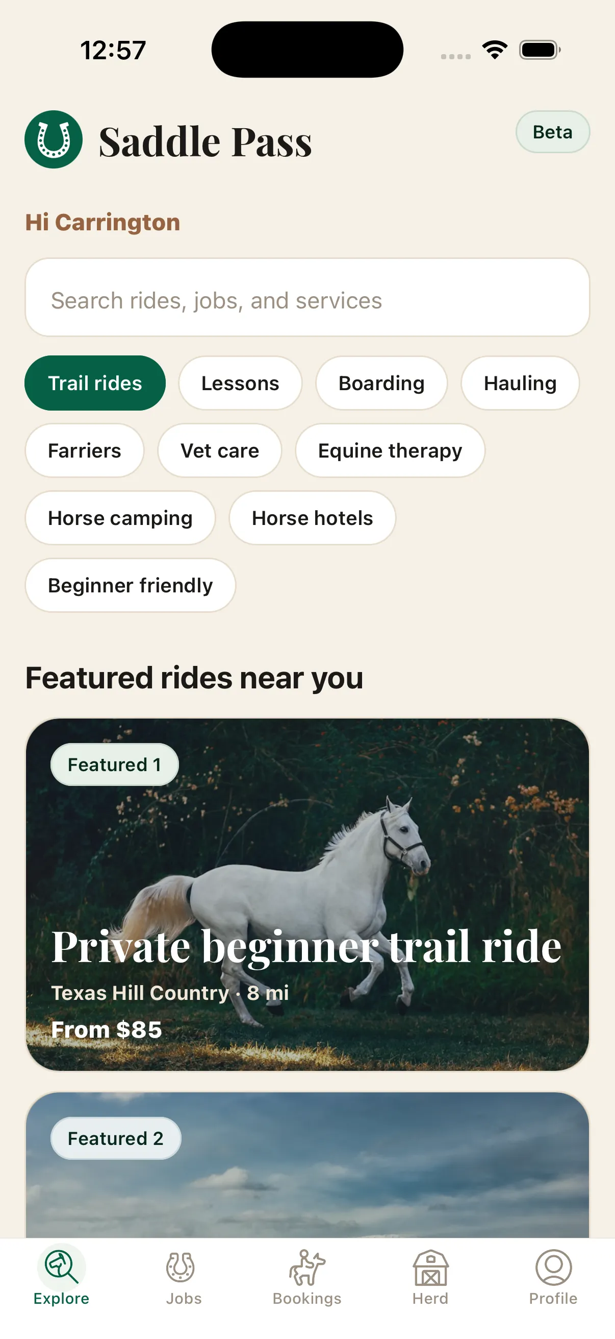
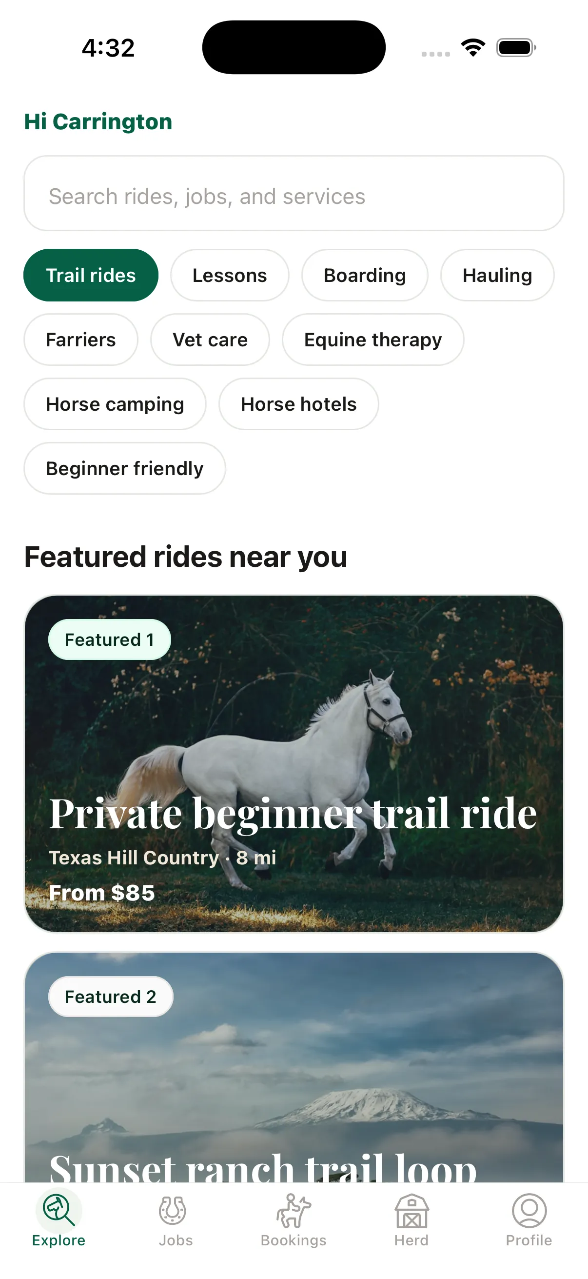
The second-order effect is the one that mattered: with that space returned, the second featured listing breaks the fold. On a marketplace home screen, whether a user sees one result or two is the difference between a card and a set — it tells them there is inventory here.
Ask Saddle Pass AI
The assistant was the piece most likely to go wrong. An open-ended chat box in a marketplace invites questions the system cannot answer — veterinary diagnoses, liability advice, medical judgments about a horse — and answering those badly is worse than not offering the feature.
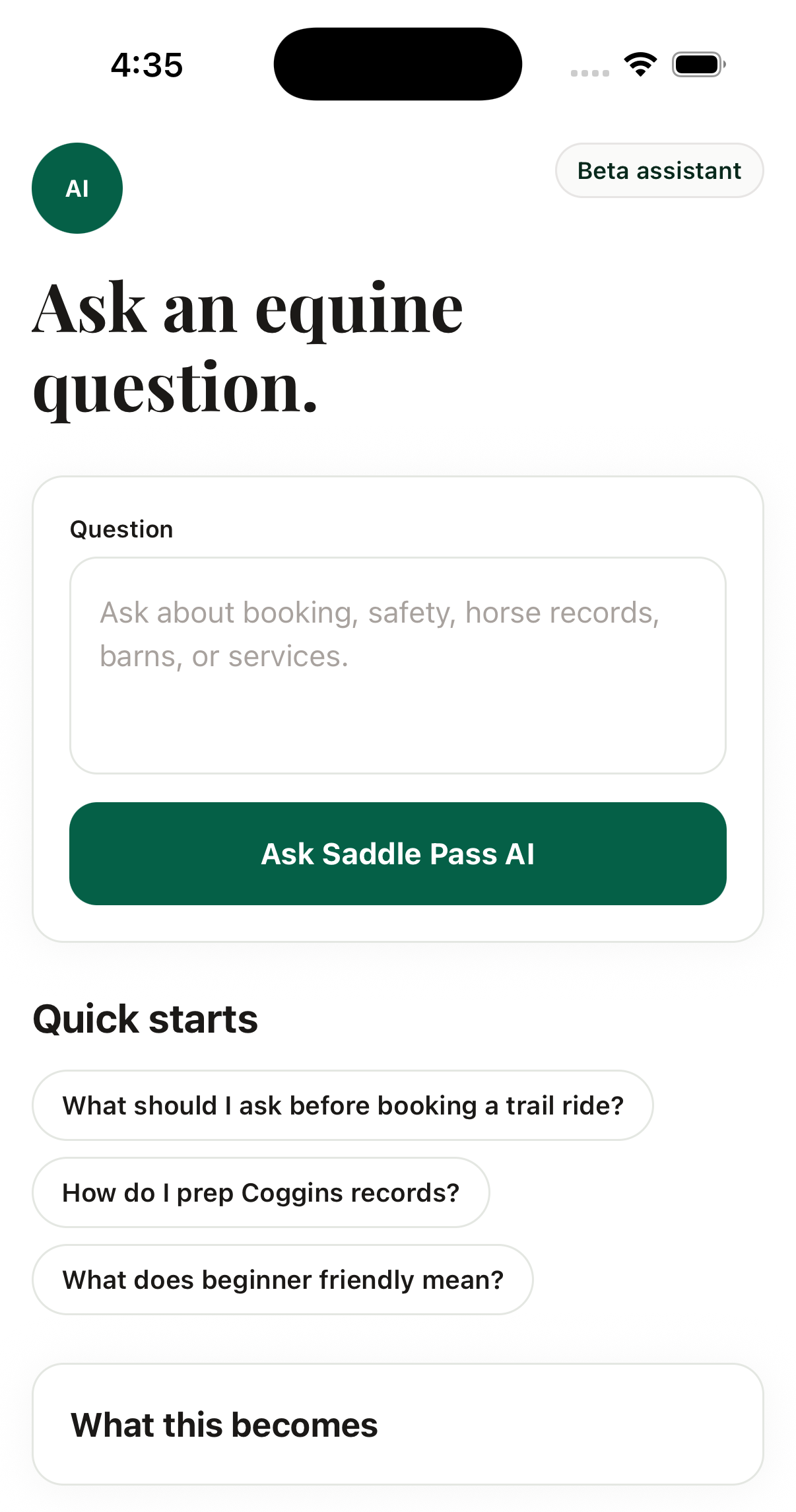
Scoping the assistant was a product decision disguised as a copy decision. “Ask about booking, safety, horse records, barns, or services” is doing the work that a refusal message would otherwise have to do later, at a worse moment, after the user has already typed out a question about their sick horse.
The quick starts are the part I would keep in any assistant I design. A blank input is a usability problem in any product, but in an AI product it is also a calibration problem — users have no model of what the system is good at until they have already been disappointed once. Showing three real questions sets the register before the first attempt.
Handing off
Design shipped to engineering as a scoped feature set across rider, owner, provider, and admin surfaces, specified against the token system rather than as flat comps. I ran weekly design reviews and bi-weekly standups with the engineering team through the build.
The web app is built and currently gated behind a feature flag, waiting on beta testing.
What I would tell you in an interview
This project has no outcome metrics, and I am not going to invent any. The product has not launched to users yet, so anything I claimed about conversion or retention would be fiction. What I can defend is the reasoning: why three roles instead of two, why onboarding got longer rather than shorter, why the token system has tests, and what I would measure first once the beta opens.
The thing I would do differently is the assistant. I scoped it by copy and by prompt design, which is the right first move, but I would want a human-in-the-loop review path for the questions it declines before I would be comfortable at real volume. Scoping tells users where the edges are. It does not tell you what they wanted when they hit one.