Adaptive Cards
Intapp was using the word "card" for two different things. Until that was fixed, no amount of redesign would have made the pattern consistent.
The brief
Client feedback kept pointing at the same need: insights had to be shareable across Intapp and Microsoft product channels. Prior research had already concluded that a card redesign on the new v4 components was necessary, and specific use cases required cards to be broadcast to multiple channels as an Adaptive Card.
The design requirement was deliberately broad — a design- and technology-agnostic solution to unify the card pattern across multiple channels. That is the kind of ask that can absorb months and produce nothing, so the first job was narrowing it to something answerable.
The actual problem was a word
Working through the audit, the blocker turned out not to be visual at all.
Right now we’re using the term “cards” for two different things: as containers and as actual UI elements. This is causing confusion and making it hard for us to talk about how we want our product to evolve.
Product managers, designers, and researchers were each using “card” to mean something different, then designing against their own definition. That produced inconsistent experiences and duplicated work, and no redesign would have fixed it — the next team would have reintroduced the ambiguity within a quarter.
So before proposing any component, I went and found out what the word meant everywhere else.
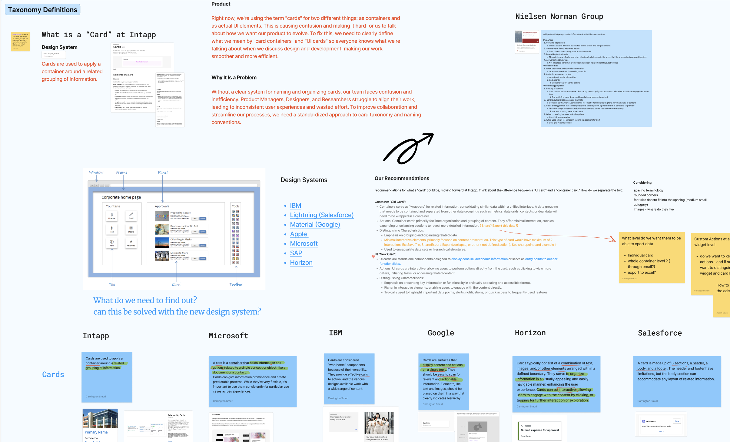
Audit before opinion
My partner pulled quantitative data from Pendo and user feedback. I took the competitive and comparative analysis: direct and indirect competitors, annotated heuristics, and a spec of every current card state and interaction in our own product.
The question I kept asking was the boring one that mattered — what separates a card from a container, from a tile on a dashboard? Without an answer, “unify the card pattern” has no test for success.
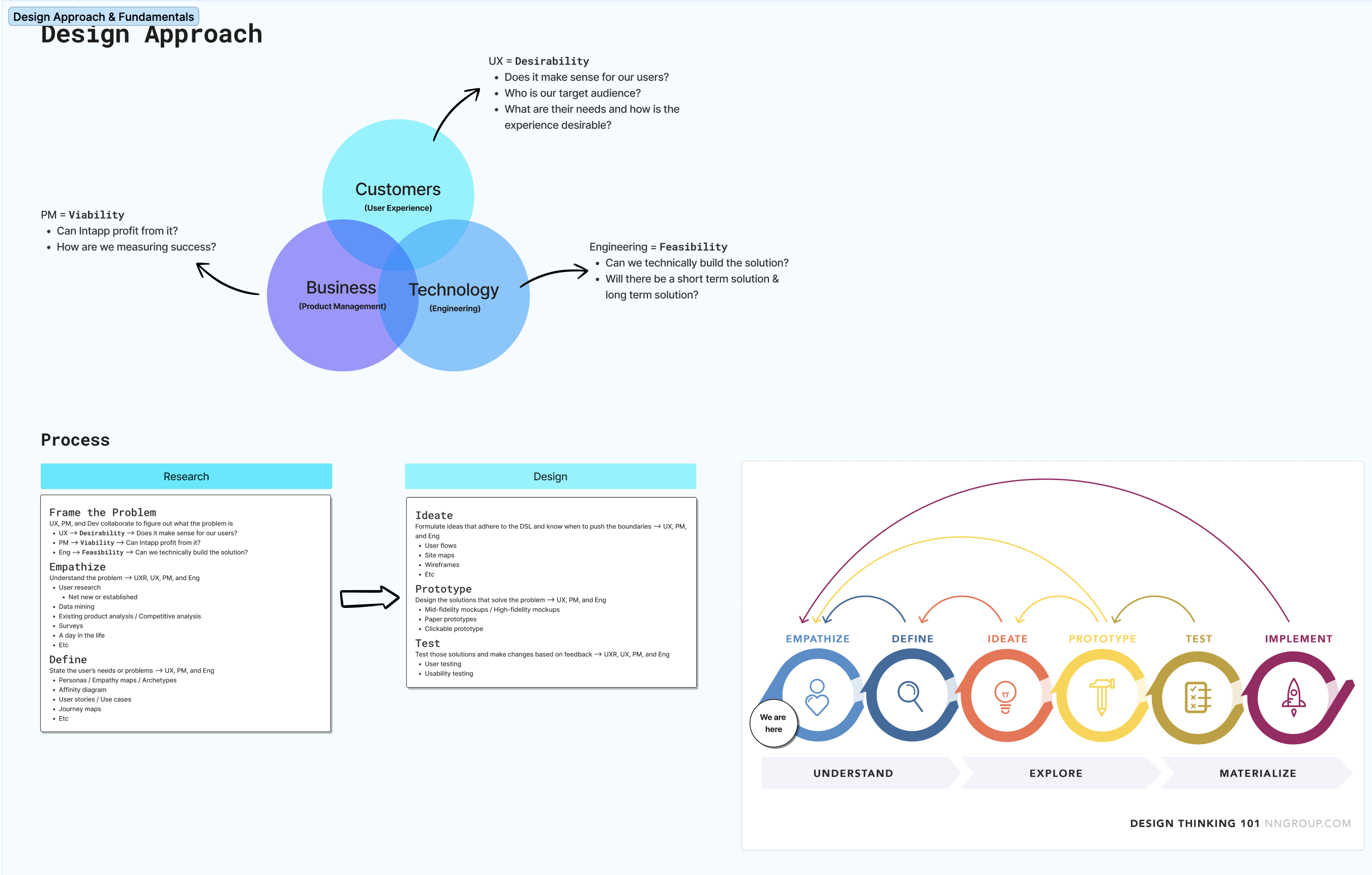
Who this was actually for
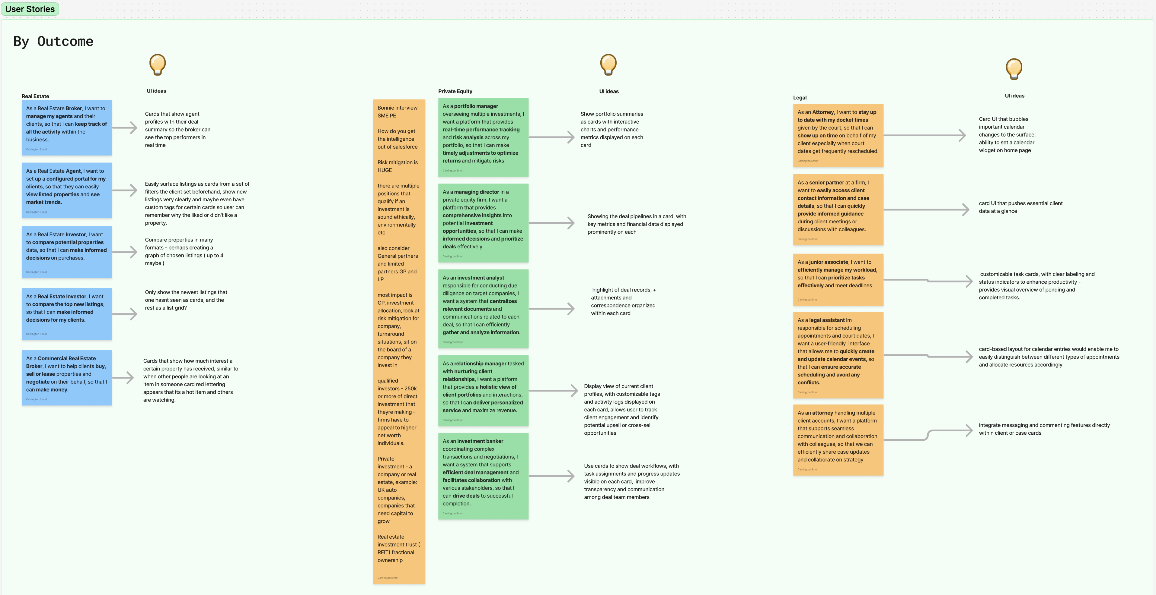
To understand how cards should behave on a dashboard, I worked through the archetypes across Intapp’s three user bases — Private Equity, Legal, and Real Estate. I pulled from prior research documentation and the ACTIVATOR persona our research team had validated earlier that year, went to research office hours with questions, and spoke with internal subject-matter experts to pressure-test my assumptions.
I also reached out through my own network for an interview with a private equity user, because the internal picture had gaps I could not close from documentation.
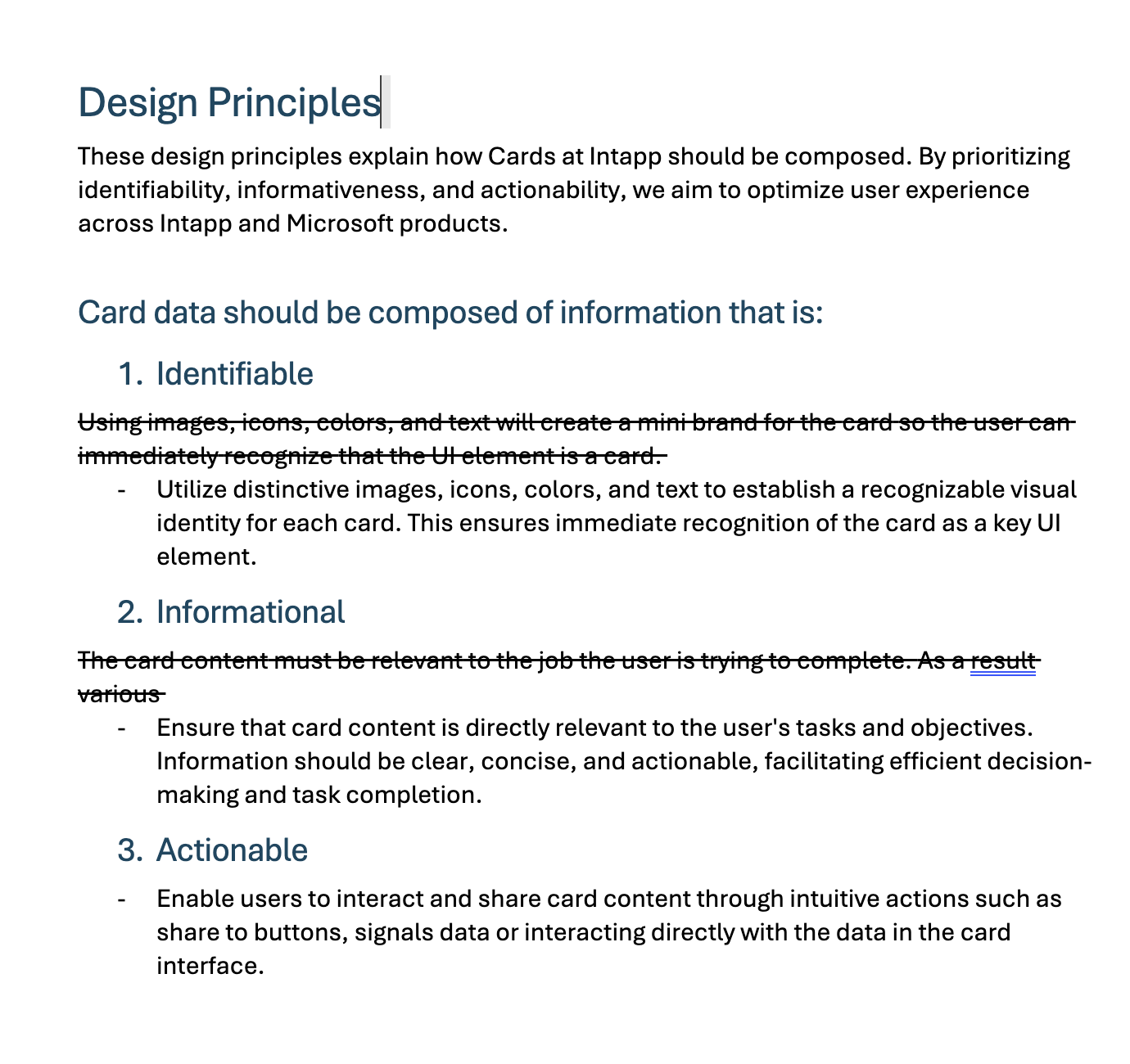
Recommendations, and renaming the thing
The recommendation was to split the overloaded term in two:
- Container — the old “card.” A wrapper that consolidates related information into a unified interface. Organises and groups; minimal interaction beyond expanding or collapsing.
- UI card — net new. A standalone component presenting concise, actionable information, or acting as an entry point into deeper functionality. Interactive by definition.
Renaming an existing component in a shipped design system is not a small ask, so the guidelines for both old and new components had to be rewritten and approved by the Design Systems team. I collaborated with them directly while drafting.
Handing off
In August the work was handed to the Design Systems team to finalise the visual layer.
The outcome was still in progress when I handed off, and I am not going to claim a result I did not see. What I can say is what shipped out of my half: a taxonomy the organisation agreed on, a competitive analysis behind it, three validated use cases, a pattern flow, and rewritten guidelines approved by the team that owns the system.
What I would tell you in an interview
The lesson I took is that design system work is frequently language work. The ask was a component redesign. The actual blocker was a word carrying two meanings, and no component would have resolved it.
What I would do differently: I would have pushed for a usage metric before handoff. I have the qualitative case for the split and the stakeholder agreement, but no measurement of whether the new taxonomy reduced the confusion it was meant to reduce — and without that, the next person to question the rename has nothing to check it against.